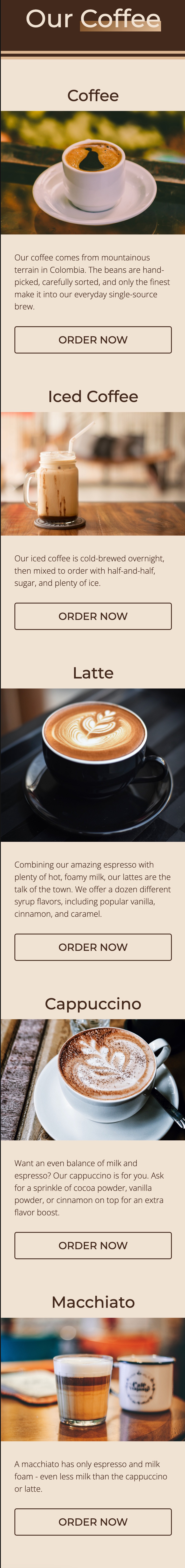
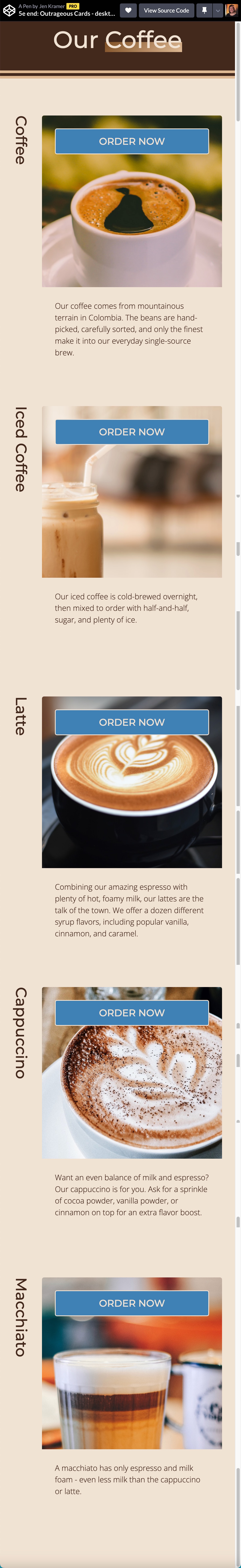
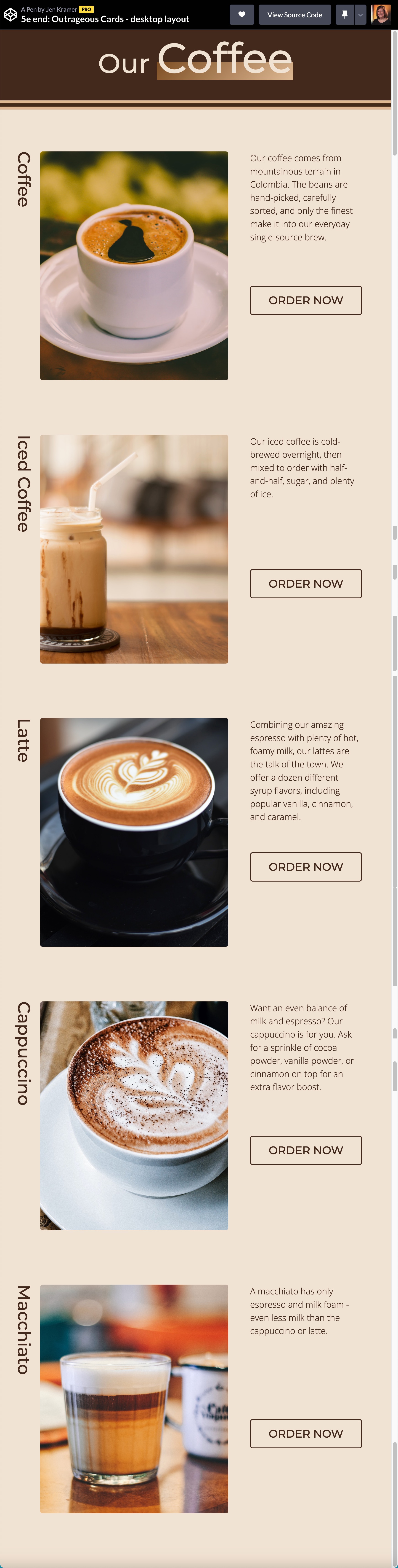
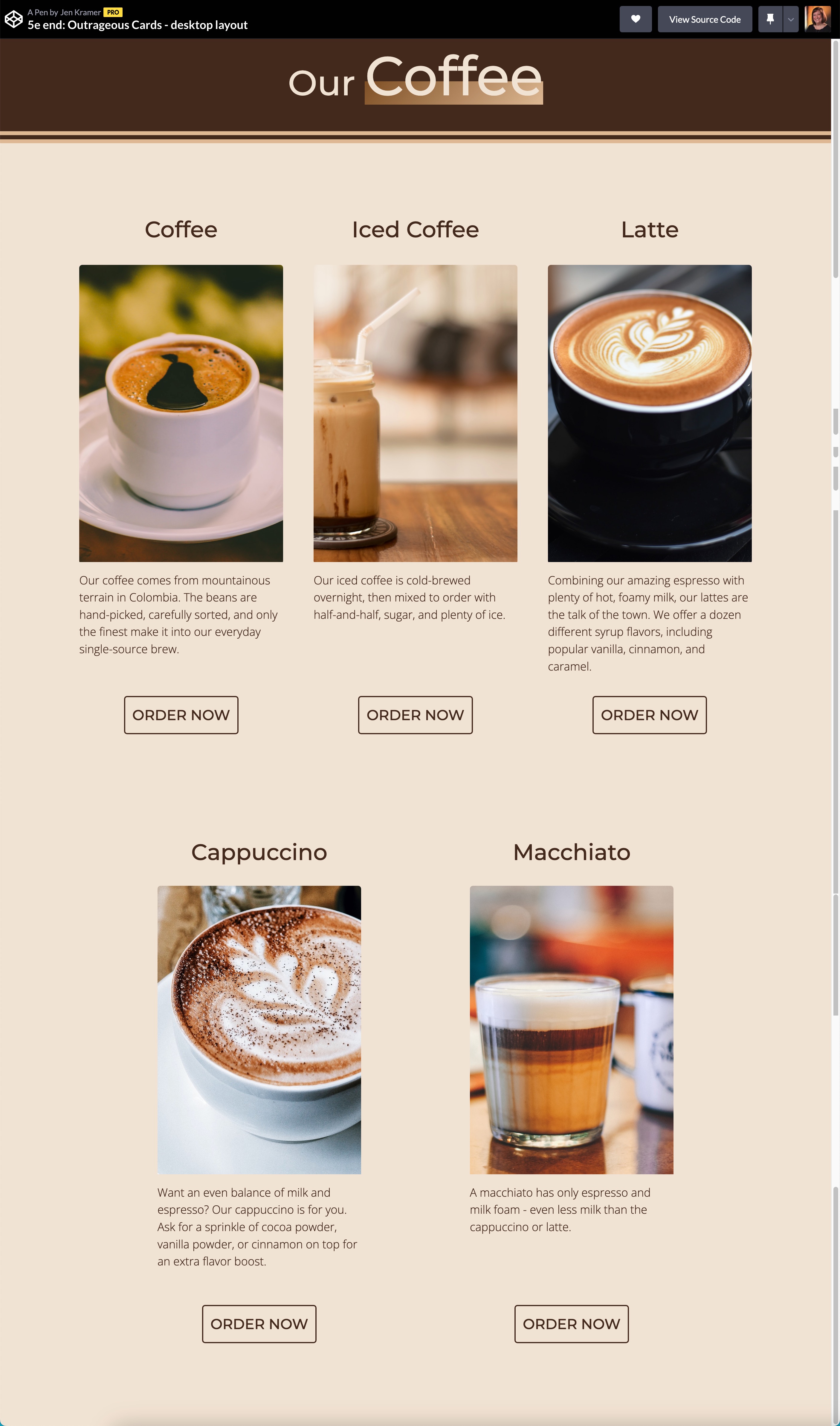
Challenge 5: Outrageous Cards
Cards are one of the most useful and pervasive patterns on the web. However, our layouts are often boring across breakpoints. Why not work with the space we have to make these layouts more interesting and compelling?
Questions to consider
- What is the right semantic markup for this page? There may be more than one answer. Why did you choose the answer you picked?
-
Layouts are all about parents and children. Consider the impact of
grouping semantic elements by surrounding them with
<div>elements. How does this change the parent-child relationship? How does this impact layout?
Next Level Ideas
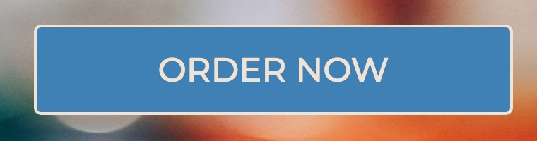
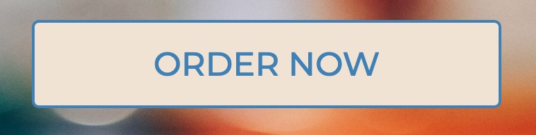
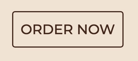
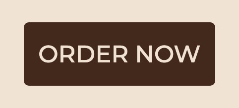
- Consider adding CSS- or JavaScript-based animation to the button, or perhaps on load.
- What happens when the "order" button is clicked? What should the next screen look like?
Hints/Spoilers
The markup for the button depends on whether the button is a link or whether it has a JavaScript action associated with it. Which do you think is correct and why?
Given that we have very different layouts for every card, grouping
elements with <div> in your HTML may be risky.
You may need control over every individual element for correct
placement.
There are two different ways to turn the text 90 degrees. One is
via a CSS
transform
property. The other is with the
writing mode
in CSS logical properties. Which do you think is better and why?