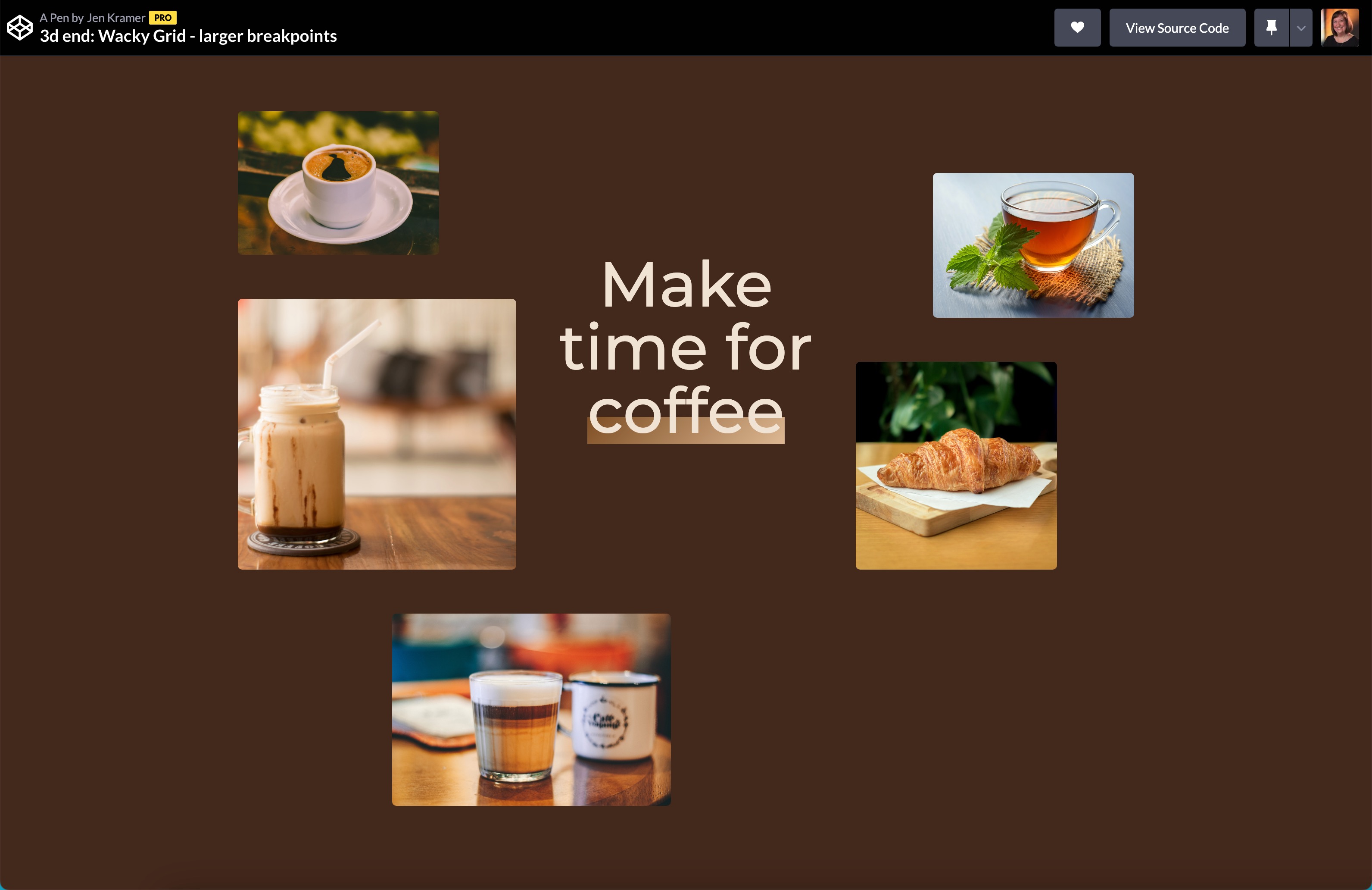
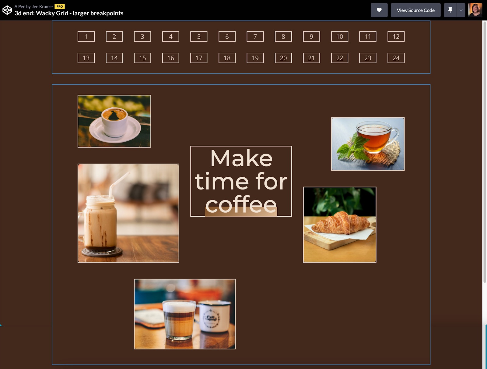
Challenge 3: Wacky Grid
Many grid-based layouts aren’t that interesting. What if they were? In this challenge, we start with a series of photos stacked of equal heights and widths. We move to a more interesting tablet layout and finish with a wild-looking desktop layout.


Questions to consider
- The number of columns on the page does not need to equal the number of images on the page. Remember that some columns may remain empty. Different images may span different columns and rows.
- The images start with similar (cropped) heights and widths, but move to different dimensions later in the design. How might we make that happen?
Next Level Ideas
- What else could you do to the images to make them fun? Consider tilting the images, animating them on hover, treating the images with some kind of edge treatment, etc.
Hints/Spoilers
Junior developers should be able to get the mobile and tablet layouts fairly quickly with this site. The desktop layout may prove more difficult. Turn on (uncomment) the “configuration grid” I’ve given you as a hint to help think about what might work for the desktop layout.